PyQt5: QCheckBox
Torna all’indice degli appunti
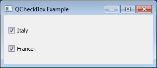
Per creare un checkbox si utilizza il costruttore QCheckBox(label).
Ci sono molte similitudini con gli altri tipi di button, ma a differenza dei radiobutton, in questo caso
la scelta di un checkbox, non esclude assolutamente gli altri.
from PyQt5.QtWidgets import QMainWindow
from PyQt5.QtWidgets import QWidget, QApplication, QBoxLayout, QCheckBox
from PyQt5.QtGui import QIcon, QColor, QFont
import sys


class MainWindow(QMainWindow):
    def __init__(self, parent=None):
        super(MainWindow, self).__init__(parent)
        self.setWindowTitle("QCheckBox Example")
        self.central_widget = FormWidget(self)
        self.setCentralWidget(self.central_widget)
        self.resize(300, 100)


class FormWidget(QWidget):
    def __init__(self, parent):
        super(FormWidget, self).__init__(parent)
        layout = QBoxLayout(QBoxLayout.TopToBottom)
        self.checkbox1 = QCheckBox("Italy", self)
        self.checkbox2 = QCheckBox("France", self)
        layout.addWidget(self.checkbox1, 0)
        layout.addWidget(self.checkbox2, 0)
        self.setLayout(layout)


if __name__ == '__main__':
    app = QApplication(sys.argv)
    main_window = MainWindow()
    main_window.show()
    sys.exit(app.exec_())
E’ possibile settare di default a checked (selezionato) un radiobutton, con il metodo setChecked,
passando come argomento True:
...
        self.checkbox1.setChecked(True)
...
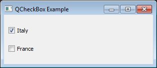
Come per gli altri button, se vogliamo fare il checkbox non sia selezionabile, possiamo utilizzare il metodo setCheckable passando come argomento False:
...
        self.checkbox2.setCheckable(False)
...
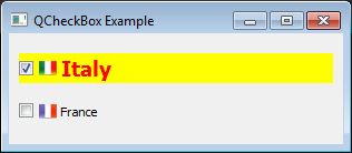
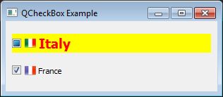
Icons
Vale lo stesso discorso fatto per gli altri bottoni: si utilizza un oggetto QIcon e lo si associa al checkbox:
...
from PyQt5.QtGui import QIcon
...
        self.checkbox1.setIcon(QIcon("Italy.png"))
        self.checkbox2.setIcon(QIcon("France.png"))
...
Colore
valgono le regole già viste per gli altri widget, ovvero si utilizzano QPalette e QColor sugli
elementi backgroundRole e foregroundRole del widget interessato:
...
from PyQt5.QtGui import QColor

...
        # background
        bg_color = QColor('Yellow')
        palette = self.radio_button1.palette()
        rb1_background = self.radio_button1.backgroundRole()
        palette.setColor(rb1_background, bg_color)
        fg_color = QColor('Red')
        # foreground
        rb1_foreground = self.radio_button1.foregroundRole()
        palette.setColor(rb1_foreground, fg_color)
        self.radio_button1.setPalette(palette)
        self.radio_button1.setAutoFillBackground(True)
...
Font
Anche la modifica del font non cambia, si utilizza cioè il costruttore QFont nella solita maniera:
...
        # Font
        font = QFont("Lucida", 14, QFont.Bold)
        self.checkbox1.setFont(font)
...
Testo
Il testo può essere settato con il metodo setText anche dopo aver istanziato l’oggetto.
E’ possibile anche utilizzare gli ampersand con il medesimo metodo.
Stesso discorso vale per settare un tooltip tramite metodo setToolTip:
...
        self.checkbox1 = QCheckBox()
        self.checkbox1.setText("&Italy")  # Ampersand
        self.checkbox1.setIcon(QIcon("Italy.png"))
        self.checkbox1.setToolTip("Select Italy")  # Tooltip
...
Stato del CheckBox
Come detto, lo stato del checkbox è settabile tramite metodo setChecked, mentre per ottenere lo
stato del checkbox si utilizza il metodo isChecked:
>>> from PyQt5.QtWidgets import QApplication, QCheckBox
>>> app = QApplication([])
>>> checkbox1 = QCheckBox("Italy")
>>> checkbox1.setChecked(True)
>>> checkbox1.isChecked()
True
>>> checkbox1.setChecked(False)
>>> checkbox1.isChecked()
False
il metodo isChecked funziona solo con il checkbox tradizionale, non in caso di tristate.
Tristate
Di default il checkbox può avere due stati, True quando è cliccato, False quando non lo è.
E’ possibile però settare un checkbox in Tristate con il metodo setTristate.
Per sapere se un checkbox è tristate, si usa il metodo isTristate
>>> checkbox1.setTristate(True)
>>> checkbox1.isTristate()
True
...
        self.checkbox1.setTristate(True)
        self.checkbox2.setTristate(True)
...
per controllare lo stato di un checkbox tristate, si usa il metodo checkState:
>>> checkbox1.setTristate(True)
>>> checkbox1.isTristate()
True
Per settare lo stato del tristate, si usa il metodo setCheckState:
>>> checkbox1.setCheckState(2)
>>> checkbox1.checkState()
2
I tre valori da passare a setCheckState sono:
0: checkbox non selezionato, corrisponde al valore Qt.Unchecked;
1: checkbox intermedio, corrisponde al valore Qt.PartiallyChecked;
2: checkbox selezionato, corrisponde al valore Qt.Checked;
...
from PyQt5.QtCore import Qt

...
        self.checkbox1.setCheckState(Qt.PartiallyChecked)
        self.checkbox2.setCheckState(Qt.Checked)
...
Visivamente l’opzione intermedia (nè True, nè False), si traduce in :
Segnali
Oltre ai segnali ereditati dal QAbstractButton, ovvero:
clicked, pressed, released e toggled, abbiamo stateChanged.
Si connette tale segnale allo slot predisposto ed il gioco è fatto.
Possiamo creare slot ad hoc per ogni checkbox:
...
        self.checkbox1.stateChanged.connect(self.on_checkbox1)
        self.checkbox2.stateChanged.connect(self.on_checkbox2)

    def on_checkbox1(self):
        print("[CB1] State changed to %s!" % self.checkbox1.checkState())

    def on_checkbox2(self):
        print("[CB2] State changed to %s!" % self.checkbox2.checkState())
...
O ne creiamo uno condiviso, al quale passare come argomento il widget:
...
        self.checkbox1.stateChanged.connect(
            lambda: self.on_checkbox(self.checkbox1))
        self.checkbox2.stateChanged.connect(
            lambda: self.on_checkbox(self.checkbox2))

    @staticmethod
    def on_checkbox(checkbox):
        if checkbox.text().lower() == "italy":
            print("[CB1] State changed to %s!" % checkbox.checkState())
        else:
            print("[CB2] State changed to %s!" % checkbox.checkState())
...
BUTTONGROUP
Anche nel caso dei checkbox è possibile legare logicamente i bottoni a buttongroup, come già visto nei
radiobutton.
Ad esempio, associare i checkbox ad un buttongroup permette di attivare l’Exclusive mode grazie al metodo setExclusive.
In questo modo i checkbox si comporteranno come i radiobutton, ovvero la selezione di uno, esclude l’altro.
from PyQt5.QtWidgets import QMainWindow
from PyQt5.QtWidgets import QWidget, QApplication, QBoxLayout, QCheckBox
from PyQt5.QtWidgets import QButtonGroup
import sys


class MainWindow(QMainWindow):
    def __init__(self, parent=None):
        super(MainWindow, self).__init__(parent)
        self.setWindowTitle("QCheckBox Example")
        self.central_widget = FormWidget(self)
        self.setCentralWidget(self.central_widget)
        self.resize(300, 100)


class FormWidget(QWidget):
    def __init__(self, parent):
        super(FormWidget, self).__init__(parent)
        layout = QBoxLayout(QBoxLayout.TopToBottom)
        self.button_group = QButtonGroup()
        self.button_group.setExclusive(True)
        self.checkbox1 = QCheckBox("Italy", self)
        self.checkbox2 = QCheckBox("France", self)
        self.button_group.addButton(self.checkbox1, 1)
        self.button_group.addButton(self.checkbox2, 2)
        layout.addWidget(self.checkbox1, 0)
        layout.addWidget(self.checkbox2, 0)
        self.setLayout(layout)


if __name__ == '__main__':
    app = QApplication(sys.argv)
    main_window = MainWindow()
    main_window.show()
    sys.exit(app.exec_())


Commenti recenti